
Auto-Classification is able to assign categories and hence meaning to documents with an unprecedented speed and quality. The technology for auto-classification has been developed over the last 15 years – from the first tentative rule based systems to elaborate statistical and semantic learn-by-example algorithms today. We see auto-classification being established as an accepted and standard approach that is provided either as a built-in function in a business software or as a toolkit in the same way as we are using OCR today.
But how to know what is a good classifier and when the optimal performance has been achieved in a classification project? Like in OCR there can be huge differences between simple textbook open-source approaches to classification and elaborate and sophisticated classifiers that incorporate all the lessons learned over the last decades.
This series of 4 articles will focus on the measurement of classification quality and will show examples by graphically comparing standard classifiers with some of the most advanced technologies today. This kind of evaluation will allow our readers to understand the methodology of measuring classification quality and at the same time demonstrate drastically why a good classifier needs more than a simple standard algorithm.
1. The precision-recall graph
The most important numbers by which any classification can be measured are precision and recall. Precision is the percentage of correctly categorized items in relation to all items categorized and hence measures the “error rate” or false positives. Recall is the percentage of items classified into a class with respect to the total number of items in the reference set of this class and hence the “correct rate”. A threshold can be used to suppress the errors and create a third set of “rejects”. For a more detailed explanation see an older post here: http://www.skilja.de/2012/measuring-classification-quality/
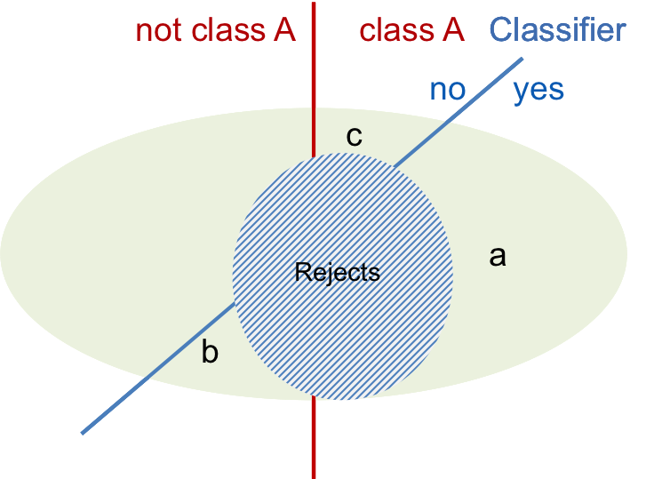
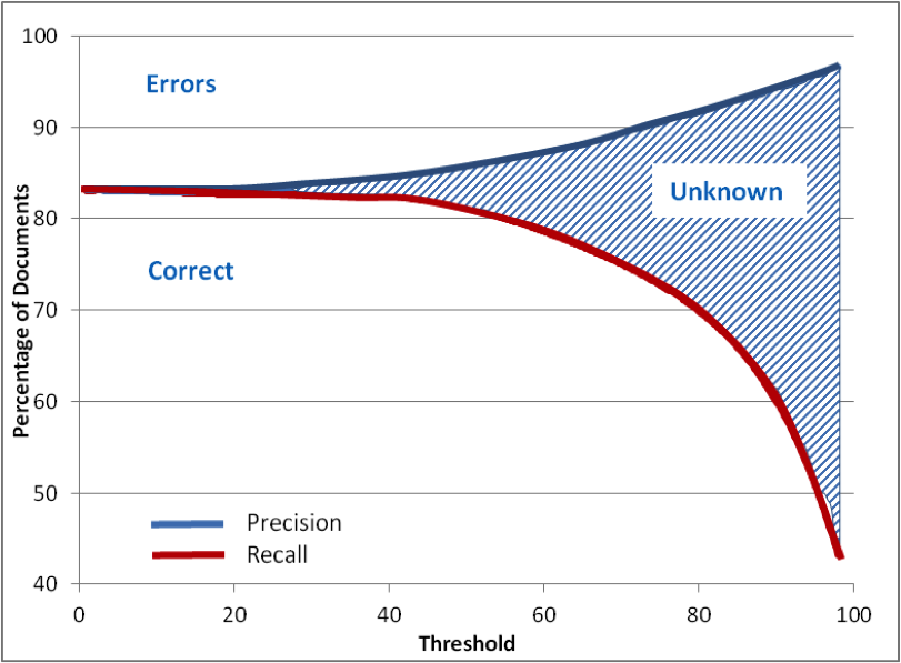
In the precision-recall graph precision and the recall percentages are plotted over the threshold showing the evolution of these values and allowing a project designer to find the correct threshold for the target error rate. A good classifier will reduce the number of errors smoothly when the threshold is applied which will lead to a rising upper curve. In the same way the correct items will be diminished producing the reject set. This is shown in the schematical graph below with the three sets of items, the Errors, Correct and Rejects.
In a real life example we have used the well known Reuters-21578 Apte test set. This set has been assembled many years ago (available at http://kdd.ics.uci.edu/databases/reuters21578/reuters21578.html). It includes 12,902 documents for 90 classes, with a fixed splitting between test and training data (3,299 vs. 9,603).
This set has been used by many developers and researchers in the past and is well known for its challenges and its accuracy.
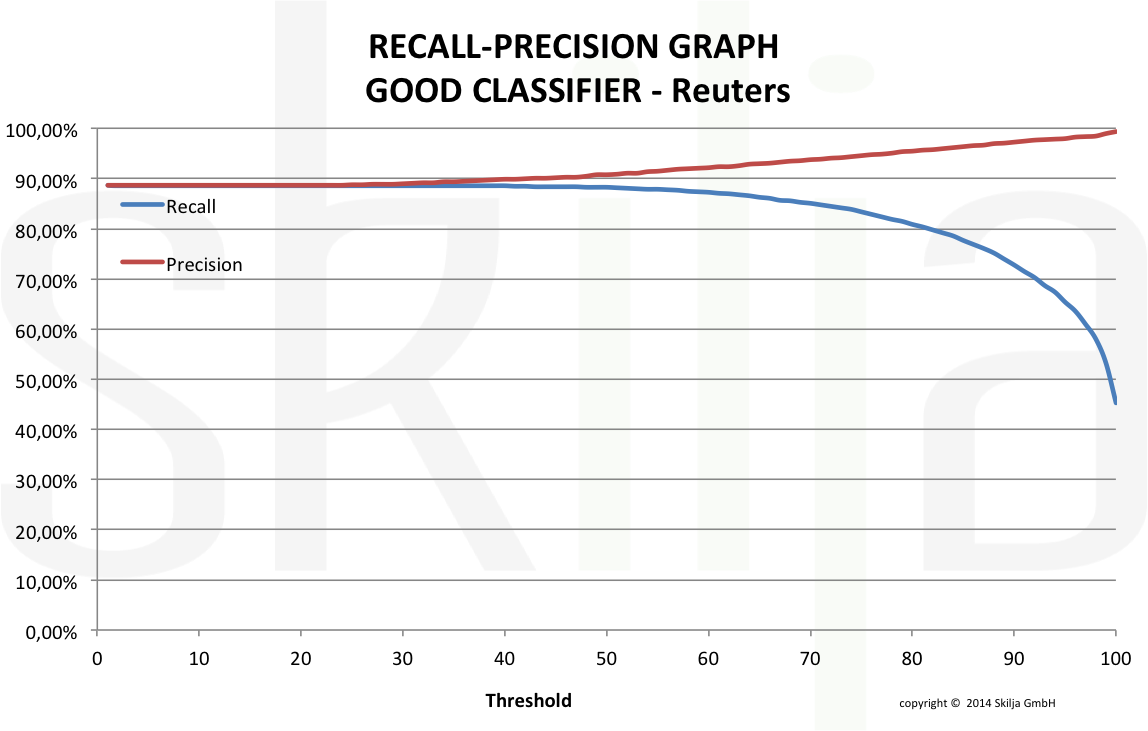
The graph below shows the precision-recall graph of a very good and well designed classifier.In contrast the next graph shows the same test set with a standard Naïve Bayes classifier.
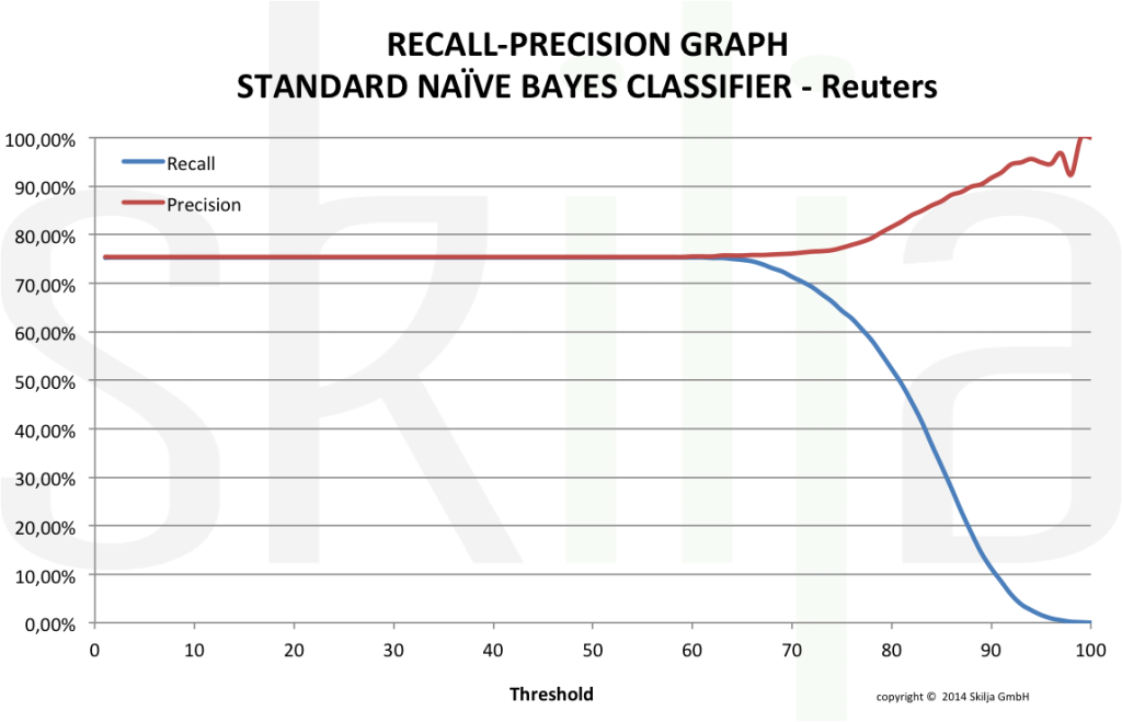
The differences are obvious. Apart from the significant differences in the absolute values of recall and precision, the standard classifier shows a very undesirable behavior. The threshold does not affect the error rate for a long time and then suddenly reduces the read rate (recall) drastically. For a project designer it will be very difficult to find the correct threshold to achieve the target error rate as the function is very unsteady.
The good classifier shows a much better behavior. The error rate decreases constantly with increasing threshold with minimal effect on the read rate. Both values run almost in parallel and it is easy to find the correct settings. Of course also the absolute rates are much higher.
There are good technical reasons in the algorithms to explain these differences but this should not be the topic of this blog. More important is to understand that there aresignificant differences and that they become visible in the graphical evaluation. In an upcoming article we will show an even better visualization of true differences. Stay tuned!