
In our small series about classification quality we have used the precision-recall graph to show the difference between a very good and a so-so classifier in a recent post that you can find here. This graphical representation is very common and easy to understand. Apart from the absolute numbers for the recall (e.g. 85% correctly classified documents) it is also important to understand how classification quality can be influenced by a threshold applied to the classification result. This can already be seen in the precision-recall graph if you know how it should look like. But it becomes much more obvious if the errors are displayed as a function of the recall. We call this diagram the inverted-precision graph which is described in this part 2 of our little series.
2. The Inverted-Precision Graph
The graph can be easily created by the same type of benchmark test that is used for the precision-recall graph. Either by measuring the classification quality against a “golden” test set or by simply using the train-test split method where a certain percentage of the training set is used for testing (e.g. 10%) while the remaining 90% are used for training. Of course this is repeated iteratively (in this case 10-times) until at each document has been classified once.
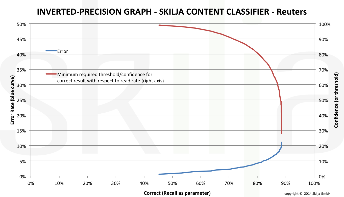
The first curve in the inverted-precision graph plots the error rate as a function of the read rate (recall). Apparently the higher the recall, the higher the error rate that you need to accept. The error rate is shown on the left vertical axis. Let me show you how the graph also allows to exactly determine the achievable recall and required threshold for a desired error rate. With the right y-axis the threshold is plotted as function of recall. By connecting the lines it is easy to see where we need to put the threshold to achieve a predefined error rate. The animated graphic below shows this step by step:
Inverted-Precision Graph and Relation between Error and Threshold
The inverted-precision graph is especially suited to uncover the weaknesses of classifiers related to thresholding.
In a real life example we have again used the well known Reuters-21578 Apte test set. This set has been assembled many years ago (available at http://kdd.ics.uci.edu/databases/reuters21578/reuters21578.html). It includes 12,902 documents for 90 classes, with a fixed splitting between test and training data (3,299 vs. 9,603). The image shows the graph for a very good and linear classifier.
The second image shows the graph for a standard classifier. This is the same data as in the first post of the series but if you compare you see that the differences between a good and a mediocre classifier become much more obvious in this representation.
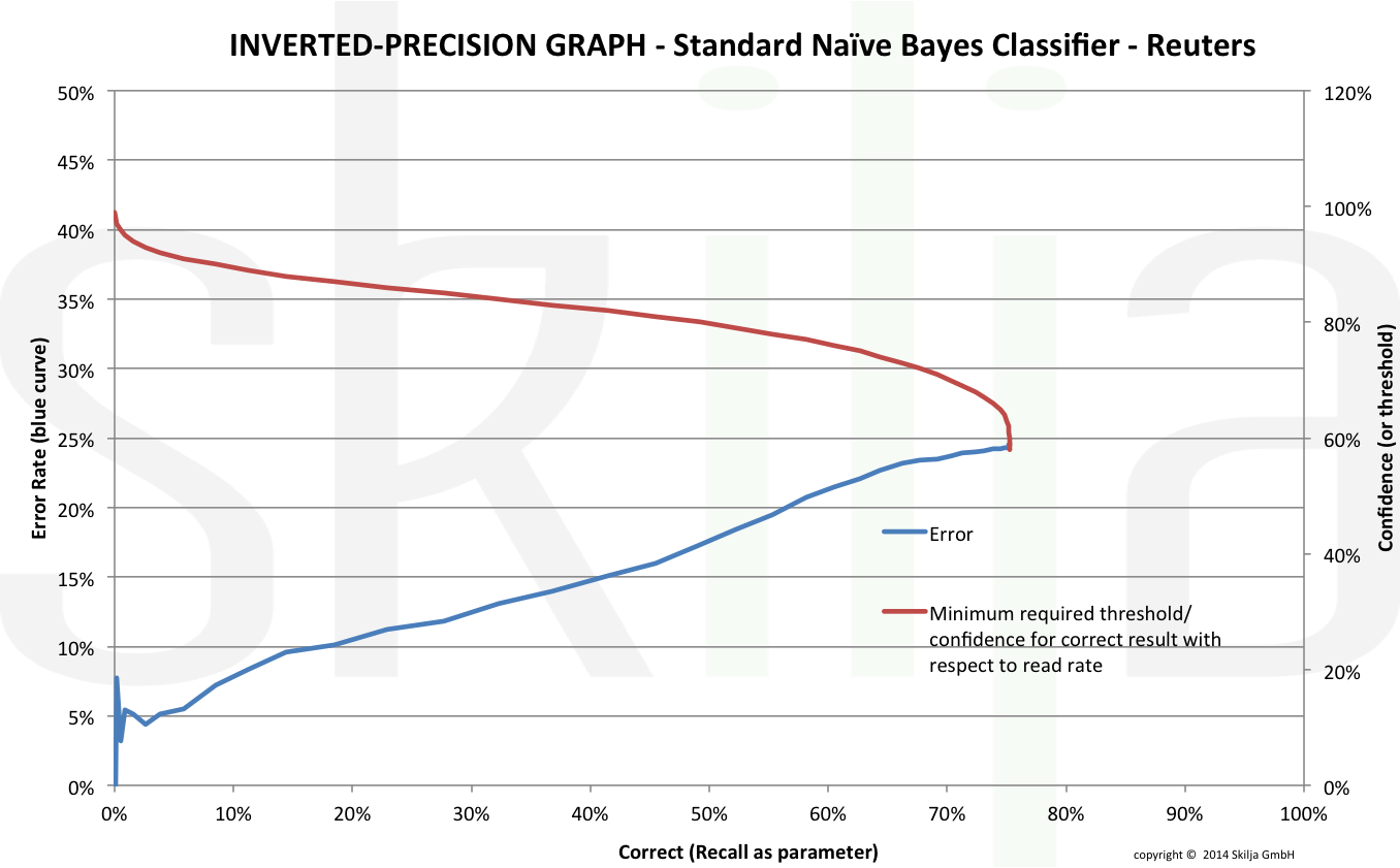
The discrepancy has mainly to do with normalization of results. Even if you accept that the absolute recall is low for the weak classifier at least the results should be normalized in the way that an error rate below 5% can somehow be achieved. This is obviously not the case. The inverted-precision graph is a good way to uncover this fact which might be due either to a weak classifier or to an incomplete training set. Therefore a good classification toolkit should always provide the means to create and visualize the results also in this way.
There are good technical reasons in the algorithms to explain the differences above but this should not be the topic of this blog. More important for users is to understand that there are significant differences and that they become visible in the graphical evaluation. In an upcoming article we will drill even deeper and show the effect of classifier quality on the separation of selected pairs of classes. Stay tuned!