
In recent articles about classifier quality we have focused on the overall statistical results. For this we have used either the precision-recall graph or the inverted precision graph. While these are very good tools to predict the overall quality of a classification scheme and hence the gain in productivity to be expected – they do not reveal where and why errors occur and how they can be improved.
Digging deeper into the results a more detailed analysis of potential conflicts and overlaps can be made. This method also shows the capability of a classifier to resolve these and gives us another measure for the quality of the classification engine used. To this purpose we analyze pairs of classes and the classificaton confidence for these. The graphical representation of this analysis is the Overlap & Separation Graph which will clearly show if there is any significant interference and what is the conflict level.
3. The Overlap & Separation Graph
Instead of looking at the overall results we look at pairs of classes. For each of the pairs we take the documents from the learn set of the two respective classes and classify them. For the Reuters test set we have for example the classes “acq” (acquisitions) and “earn” (earnings reports). The result gives us the classification confidence for a document from acq to be in acq and another confidence to be in earn. Of course we would expect that most of the documents in the learn set from acq are highly confident in acq – which is the case. But a few also have significant confident results from earn. If the confidence from earn for a acq document is higher than for acq then we have an overlap. This can of course happen because a lot of documents about acquisition of a company will also contain a significant vocabulary about results of this company. A news document might very well cover both aspects when a company is about to be acquired.
This analysis of pairs can be represented in a diagram that shows the cumulative percentage of documents from acq as a function of the difference of confidences between the two classes. In the same diagram we can depict the cumulative percentage of the earndocuments:
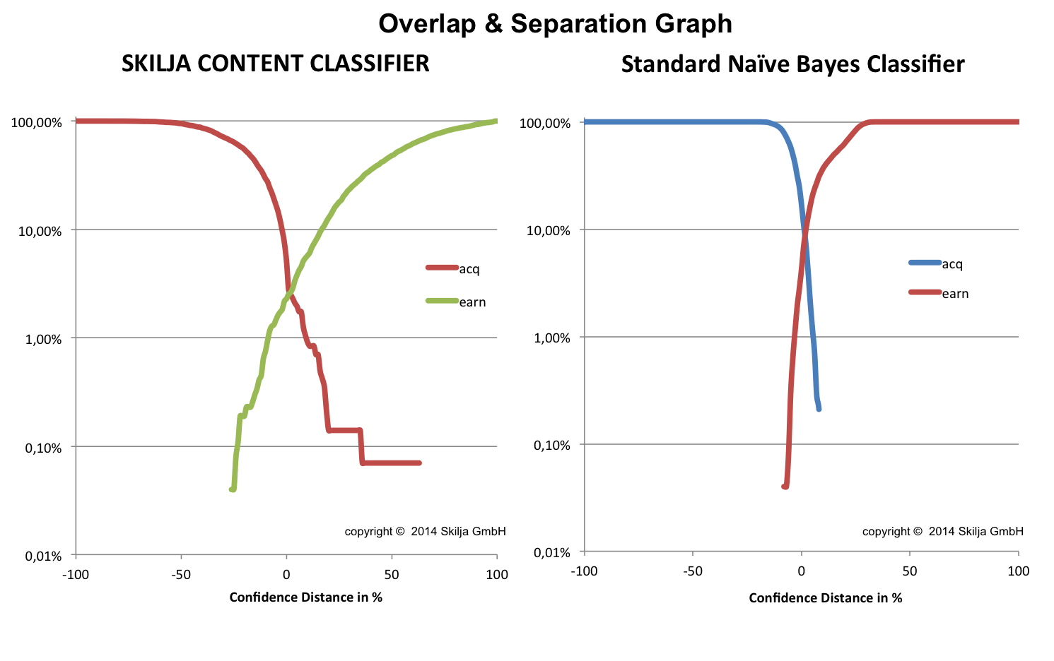
As you can see there is an overlap – which is not surprising, given what we said before. Please note that the percentage of documents is represented on a logarithmic scale. We therefore talk about a very low number of overlapping documents. In the left image the two lines cross at about 2% of documents – in the right image the overlap is significantly larger at 10%.
So you can also clearly see what is a good classifier which can separate even difficult cases (left graph) and what is a so-so classifier (right graph). We have used the same comparison of classifiers and the same dataset used in previous posts of this series. It is immediately obvious that the Skilja classifier is performing much better in the separation than a standard algorithm.
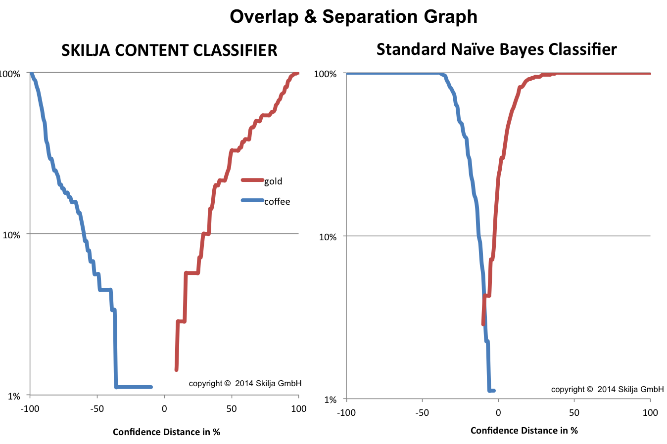
This becomes even more obvious if you compare coffee and gold. You would think that they can be well separated. Yes they can – by Skilja Content Classifier on the left side while the other classifier shows an unexpected overlap error of about 3% of the documents.
This analysis can be performed for any pair of document classes and the system can even point out the classes with most conflicts and overlaps. This is a built in function into the Classification Designer and should be a must for any tool in the market. Because now you can actually select the documents below the intersection in your learn set and take a closer look at them. And maybe determine that they are not correct or decide that you need to add more training samples to this class to make it perform better. Because the system can only perform what you teach it. Our analysis is able to directly guide you to this conflict pairs and help to quickly teach the system and correct its errors to achieve the best possible classification.
Of course actually using this analysis and graphs is much easier than digging into the details of the calculation. So don’t be afraid if this sounds complicated. Interactive usage is easy and intuitive. In the next and last part of our sequel we will dig even deeper and see what we can see from the analysis of a single document. Stay tuned.